Experience Design
Digital Installation at US Open
IBM Watson
Overview
lorem ipsum
As part of this major evolution, I led the UX strategy and design initiatives to modernize the platform. This case study focuses on the strategic groundwork that drove the global redesign and the complex UX challenges we solved to create a cohesive, scalable redemption experience.
Project Highlights
-

Discovery
Discovery centered on analyzing Citi’s global market architecture and auditing localized site variations to align user needs, business goals, and platform capabilities.
-

Approach & Execution
Developed comprehensive sitemaps, user flows, and wireframes to restructure the platform, while componentizing key layouts into a scalable UI kit for global implementation.
-

UX Challenges
Our focus to solve the platform's core usability friction - these key UX challenges defined our design priorities and drove the biggest impact for end users.
Discovery
Experience Strategy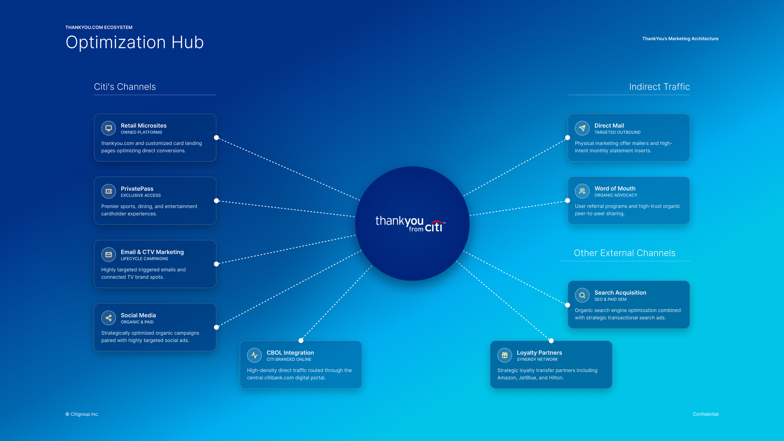
Over years of global expansion, ThankYou.com became fragmented and cluttered, leading to inconsistent user experiences across international markets. To restore clarity and drive engagement, I led a comprehensive redesign focused on four strategic pillars:
Global Brand Alignment:
Unify all regional reward sites under a single, cohesive design language.
Scalable Design System: Build a flexible component library capable of accommodating unique market variations, localized catalog rules, and fulfillment flows.
Optimized Redemption Journey: Streamline navigation and discovery so users can effortlessly find high-value rewards and check out without friction.
Mobile-First Experience: Architect a responsive, performance-driven experience optimized for mobile-first behavior.
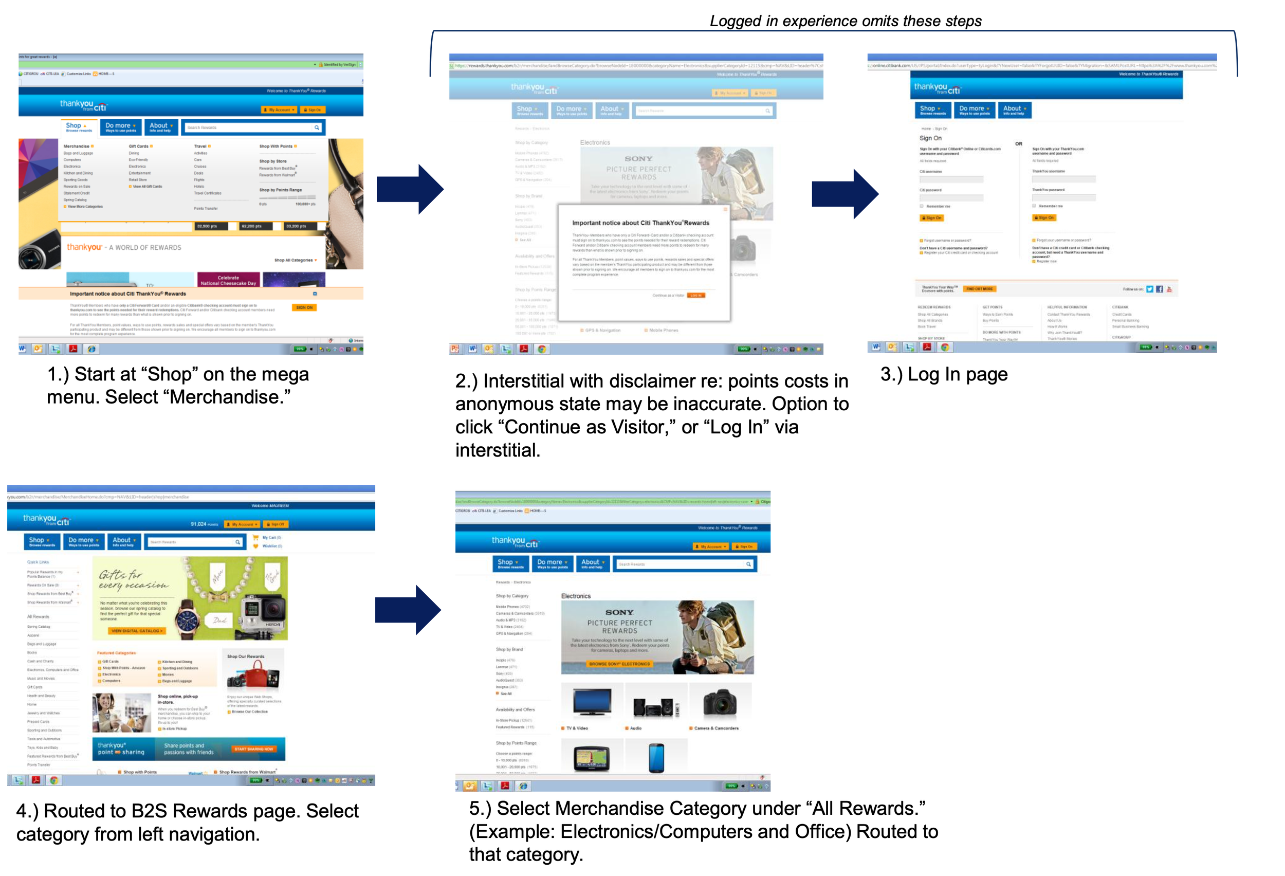
Key Audit InsightsWe conducted an end-to-end UX audit across key touch points—including the homepage, reward catalogs (merchandise, gift cards, travel, points transfer), checkout, and account servicing. Our evaluation revealed five critical friction points:
Information Overload: Homepages lacked a clear visual hierarchy, overwhelming users with competing promos and unorganized content.
Navigational Friction: The mega-menu structure was poorly categorized, making key reward types difficult to discover.
High Checkout Friction: Redemption required up to 8 distinct steps, causing significant drop-off during checkout.
Context Gaps: Users lacked essential details regarding point value, program benefits, and account balances at critical decision points.
Localization Inconsistencies: Information architecture and category naming varied wildly across international markets, confusing global members.
Approach & Execution
Scaling ThankYou.com across global markets over three years required a highly structured, modular design strategy. After establishing the U.S. foundation, we implemented a staggered phase-in to adapt the platform for international regions.
Key InitiativesUX Strategy & Operations: Co-led template strategy with design leadership and production teams, establishing clear design requirements and workflows to align our respective product teams.
Localization & Gap Analysis: Systematically audited regional market nuances to ensure local fulfillment rules and offerings integrated smoothly into the global core.
Scalable Modular Framework: Architected a modular page system where global markets could toggle modules on or off depending on regional capabilities, maintaining visual consistency while accommodating varied feature sets.
UX Challenges
Transforming ThankYou.com meant untangling core friction points across the entire customer lifecycle—from initial discovery to final redemption. To deliver a seamless global platform, we focused on three pivotal UX challenges: restructuring complex site navigation, dynamically surfacing tiered customer pricing, and unifying a fragmented checkout experience constrained by regional fulfillment vendors and varied retrieval methods.
UX Challenge 1: NavigationTo streamline discovery across a vast rewards catalog, we redesigned the site architecture with a clear, two-tiered navigation path:
Global Mega-Menu: Organized alphabetically for rapid scanning, allowing users to jump directly to primary category listing pages (PLPs) or browse by featured brands right from the landing page.
Persistent In-Context Filtering: Once on a PLP, users can refine results by category, brand, point value, and delivery method. To prevent cognitive overload from extensive inventory, we docked the filter controls in the sticky header for effortless access as users scroll.
UX Challenge 2: Dynamic Tiered Pricing & Point AffordabilityBecause reward pricing and promotional discounts varied based on cardholder tier and account status, catalog pricing could not remain static. Additionally, users often struggled to calculate whether their current point balance was sufficient for specific items while browsing.
Dynamic Pricing: Authenticated user sessions dynamically rendered cardholder-specific pricing, tailored discounts, and exclusive promotional offers directly on product cards and detail pages.
Clear Affordability Indicators: Integrated visual point-value badges and status indicators across product cards. This gave users real-time feedback on their purchasing power relative to their account balance, eliminating guesswork before checkout.
UX Challenge 3: Streamlined Checkout & Fulfillment FlexibilityPreviously, each reward category operated on a distinct, isolated checkout experience—creating extreme friction for multi-item redemptions. To solve this, we consolidated all category paths into a unified, 3-step transaction flow capable of processing mixed-reward carts seamlessly.
Vendor-Aware Cart Structure: Step 1 automatically groups items by reward category and fulfillment provider, giving users clear visibility into how different rewards (e.g., gift cards vs. physical merchandise) will be delivered.
Interactive Points-to-Cash Slider: Introduced a flexible payment controller that lets users intuitively adjust the split between points and credit card payment in real time.
Live Balance Summary: A persistent financial summary calculates post-transaction balances, explicitly showing points redeemed, remaining balance, and out-of-pocket costs before final confirmation.
Localized In-Store Pickup Integration: To support regional market requirements, we incorporated dynamic point-of-pickup selector widgets directly into the checkout flow. This allowed global cardholders to seamlessly search, select, and verify localized retail locations or fulfillment hubs based on regional vendor APIs.
Streamlined Review & Confirmation: Step 2 provides a comprehensive transaction overview, allowing users to verify fulfillment details before confirming their order in Step 3.
Results & Impact
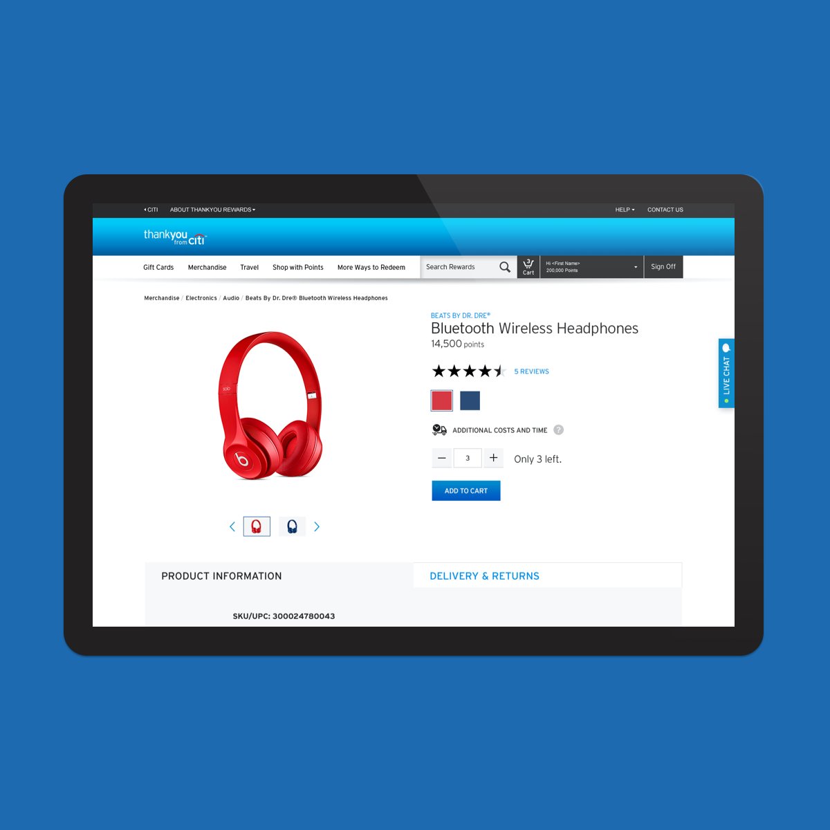
The global redesign transformed ThankYou.com from a fragmented, legacy rewards site into a scalable, high-performing global platform. Key outcomes included:
Increased Conversion & Redemption Velocity: Streamlining the 8-step process into a unified 3-step checkout significantly reduced cart abandonment across all reward categories.
Global System Scalability: The modular template architecture and reusable UI kit reduced design and development effort for subsequent international market rollouts by over 40%.
Enhanced User Satisfaction: Real-time point affordability indicators and transparent split-pay controls eliminated ambiguity, driving higher engagement with tiered rewards.
Unified Brand Presence: Successfully aligned international markets under a single, modern design language while respecting local fulfillment and vendor variations.